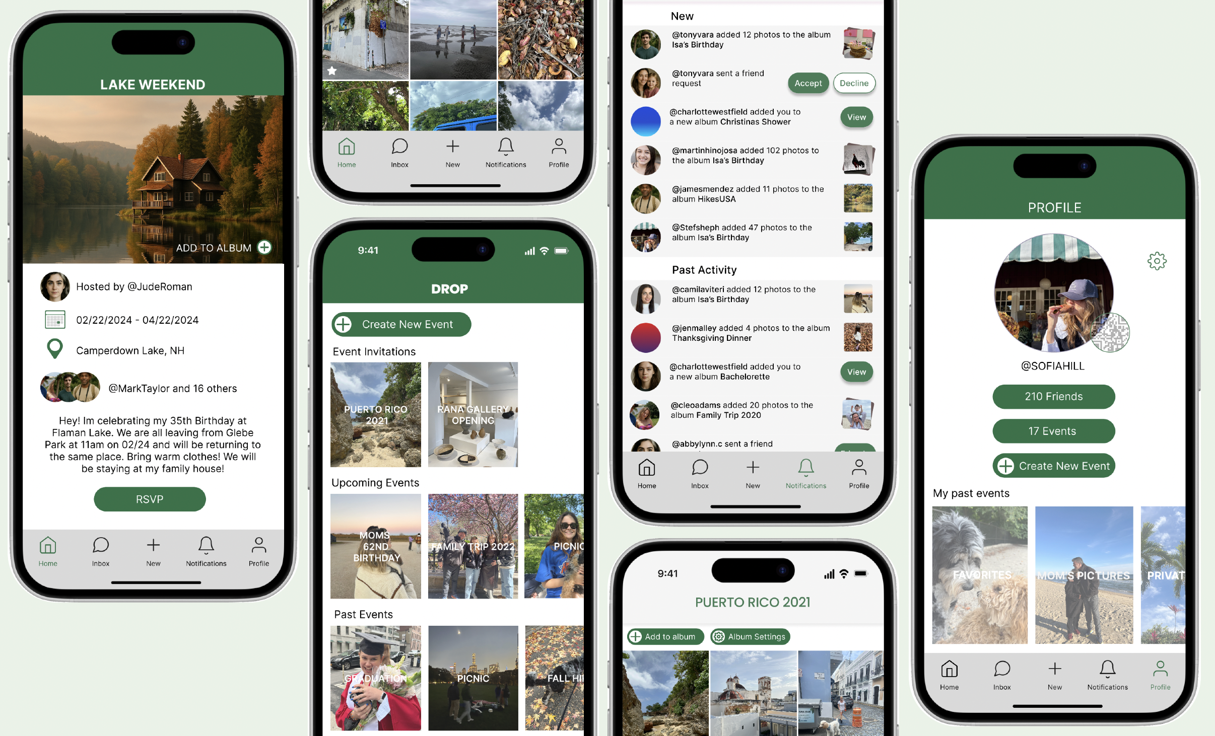
The product:
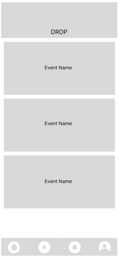
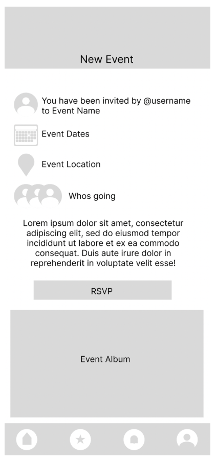
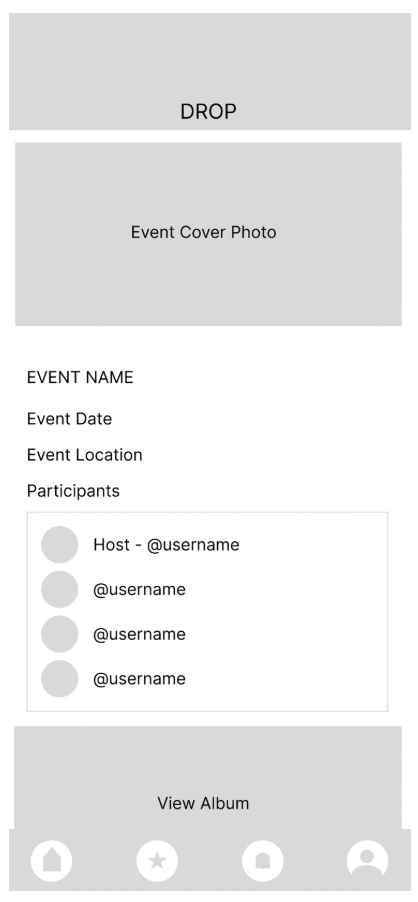
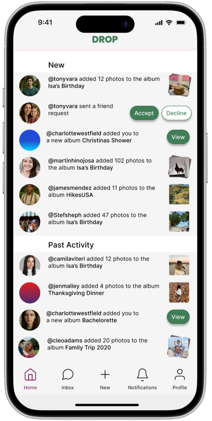
Drop is a social event app that brings everything around an event into one place. Invitations, RSVPs, guest lists, and photo sharing all live together so that nothing gets lost between platforms and no memory gets left behind.
Project duration:
August 2024- November 2024
The problem:
Event planning has a coordination problem. Invites go out over text, details live in email, directions open in Maps, and photos end up scattered across group chats and camera rolls. By the time the night is over, the memories are already fragmented. Users don't need another app. They need one place where the whole event lives.
The goal:
To design a private, event-centered space where attendees could handle everything in one place, from RSVPs and logistics to collaborative photo albums and post-event memories. Drop isn't just about planning. It's about making shared experiences easier to hold onto.
Project Overview
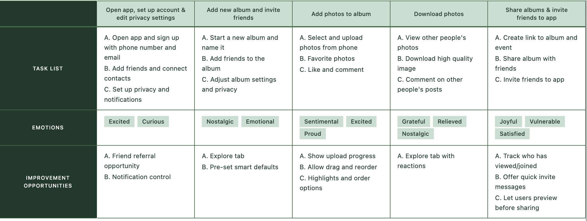
I conducted interviews and surveys with users across age groups to understand how people currently manage social events. The pattern was consistent: most people were bouncing between four or more platforms just to handle a single event. Beyond the logistical frustration, privacy came up repeatedly. Existing platforms like Instagram and Facebook felt too public, and users wanted control over who could see event details and photos.
Key insights included:
Event information is scattered across platforms
Photo sharing is inconsistent and low quality
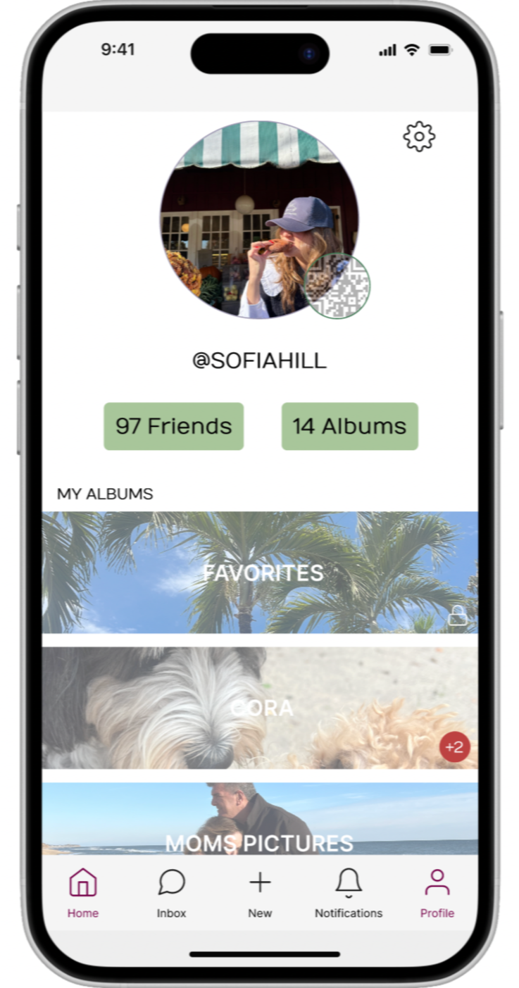
Users want a private, controlled space
Users want to connect with others who attended the same event
Understanding the User
User Research: Pain Points
Users juggled messaging apps, email, calendar, maps, and social media just to manage a single event. Nothing lived in one place.
1 Too many platforms
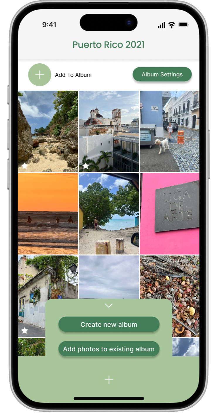
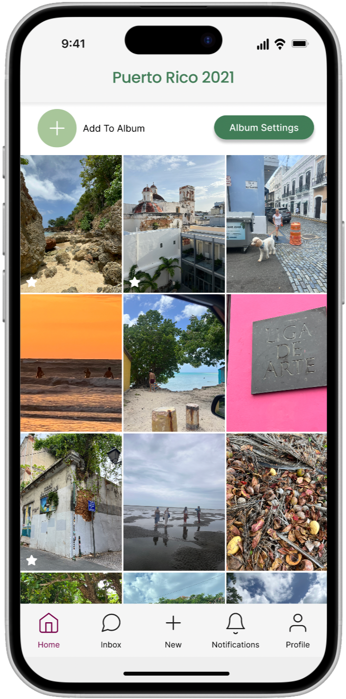
People shared photos through DMs, AirDrop, WhatsApp, and group chats, often at reduced quality. Many photos never got shared at all.
2 Fragmented photo sharing
3 Asking feels awkward
Users felt uncomfortable tracking down attendees to request specific photos of themselves, so they simply went without.
4 Too public
Apps like Facebook and Instagram didn't offer the privacy users wanted for personal events and guest lists.
Understanding the User
Juliette
Age: 29
Education: Bachelors Degree
Hometown: New Hampshire
Family: Single
Occupation: Journalist
“I know I’m in a bunch of photos from the event, but I feel awkward asking people to send them especially the specific ones I want. I just wish there was one place where we could all see and save everything.”
Goals
See the guest list before confirming attendance
Download event photos without having to ask anyone
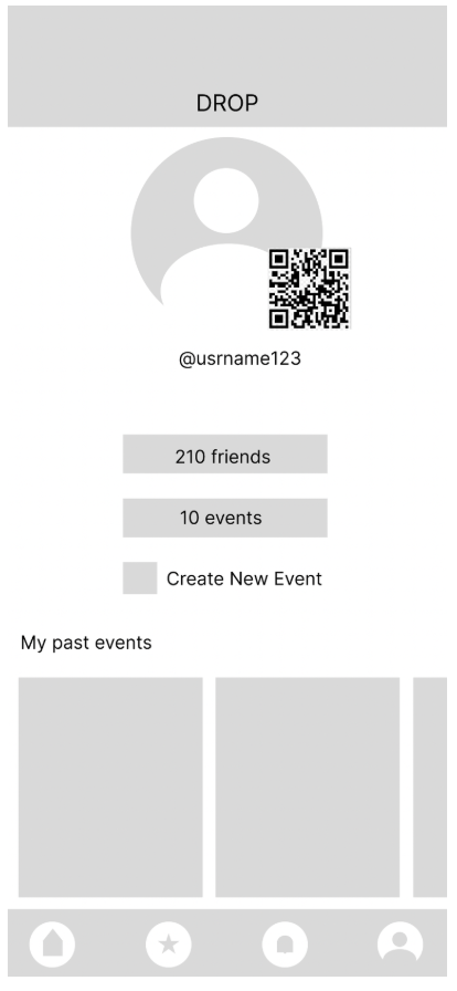
Keep a personal album of events she's attended
Replace scattered DMs with one place for event details
Frustrations
Photos lose quality when shared through messages or group chats
Feels awkward asking friends for specific photos of herself
Important event updates get buried in group threads and missed
Juliette is a social, outgoing professional who loves organizing and attending events, from dinner parties and concerts to weekend getaways. She manages group plans across scattered texts, calendar invites, and social media, which makes even simple events feel more chaotic than they should. She values shared experiences and wants to hold onto the memories, but photos get lost, details get buried, and following up with everyone afterward feels like a second job.
I mapped Juliette's experience from hearing about an event to trying to collect photos afterward. The journey revealed key moments of friction, particularly around information overload and the awkwardness of following up with attendees post-event.
User Journey Map
Understanding the User
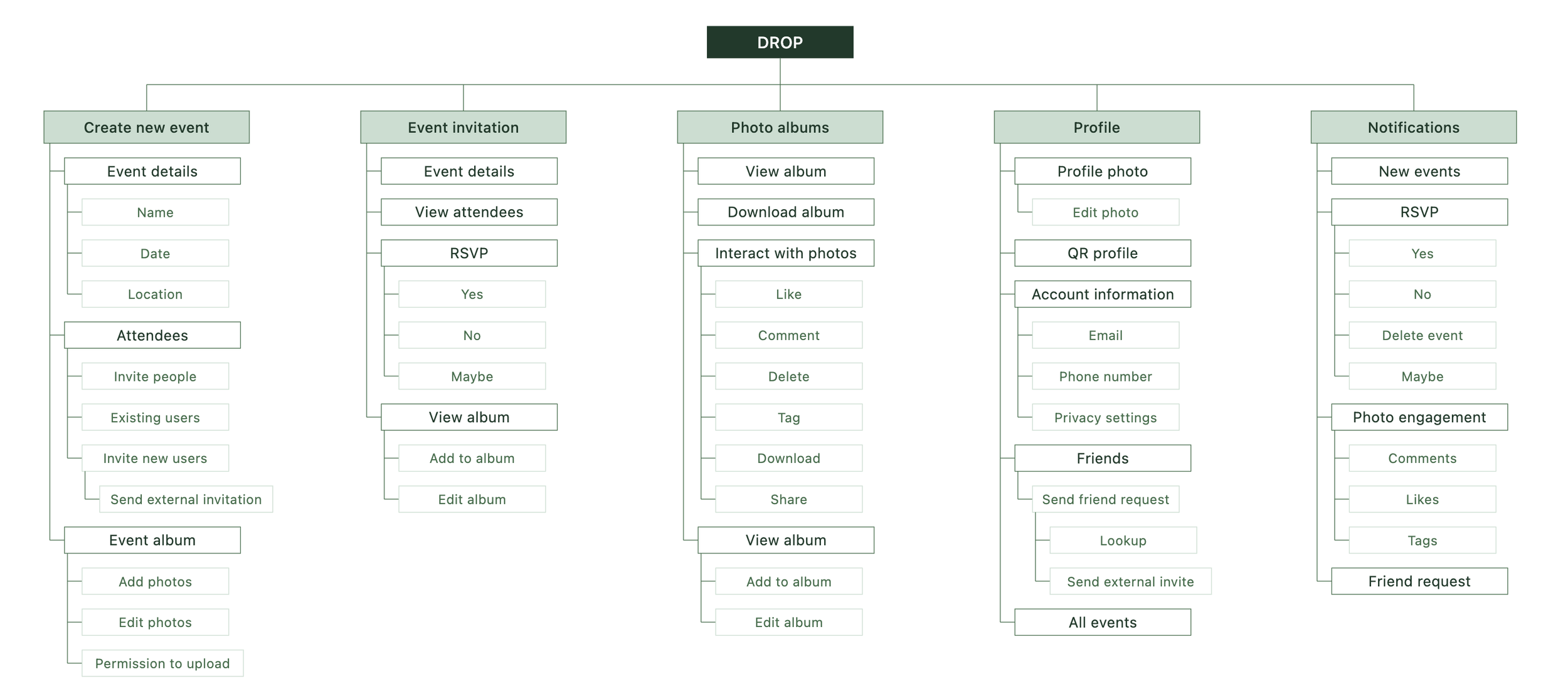
I mapped out the app's structure early to ensure key features like event details, guest lists, and photo albums were logically grouped and easy to navigate.
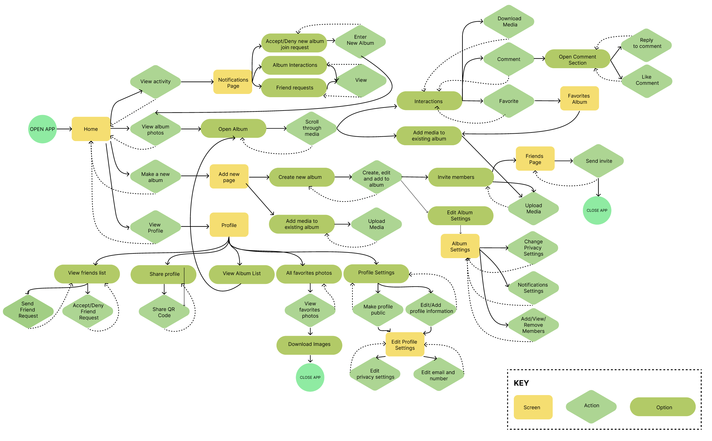
User Flow
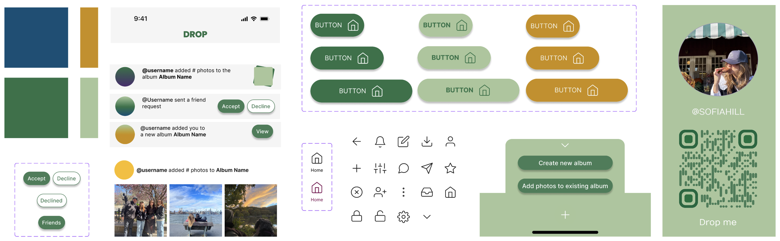
Design System
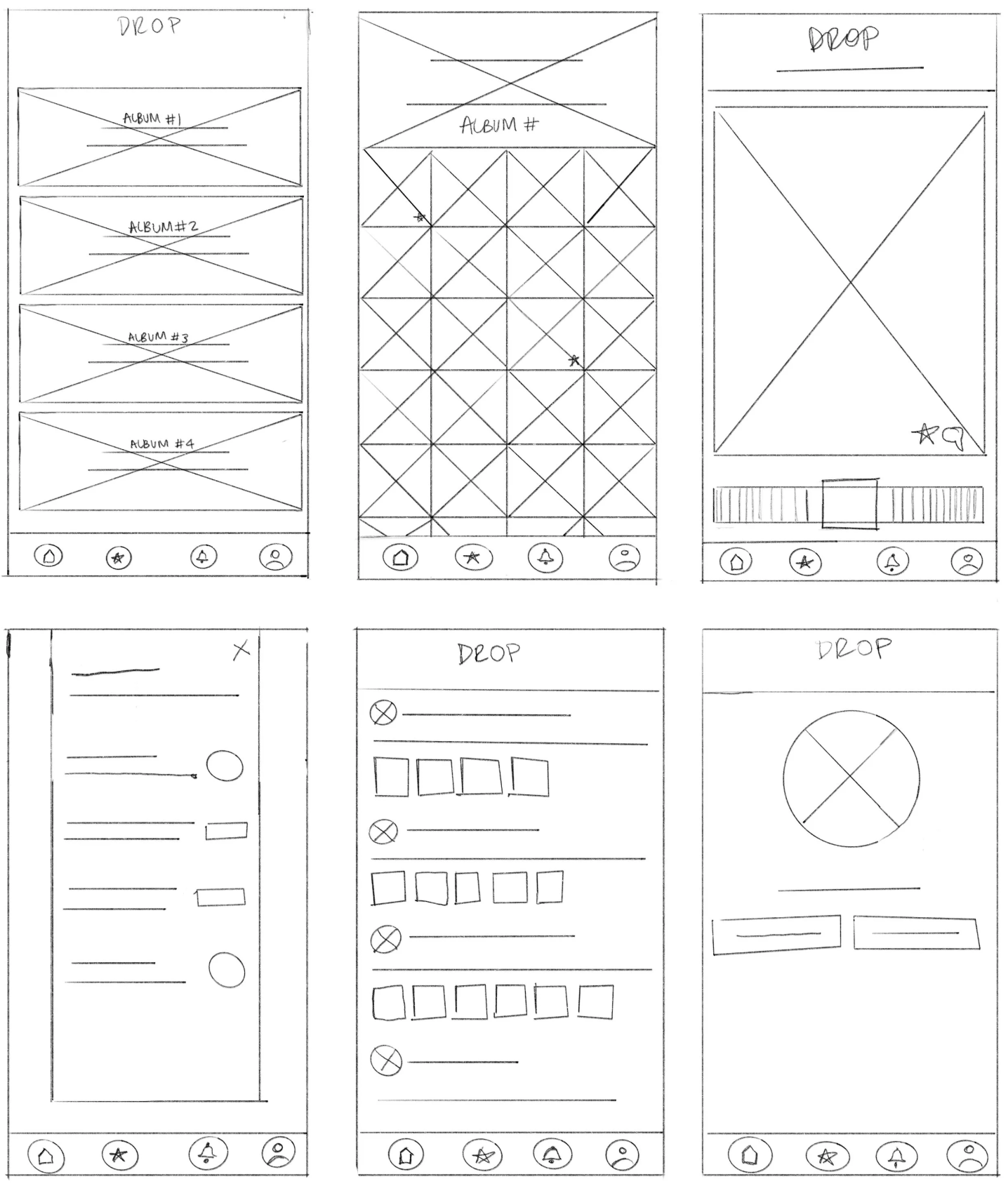
I started with paper wireframes to quickly explore layout ideas and test different approaches before committing to digital designs.
Paper wireframes
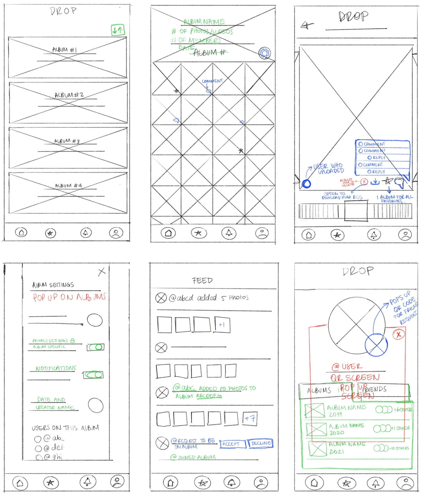
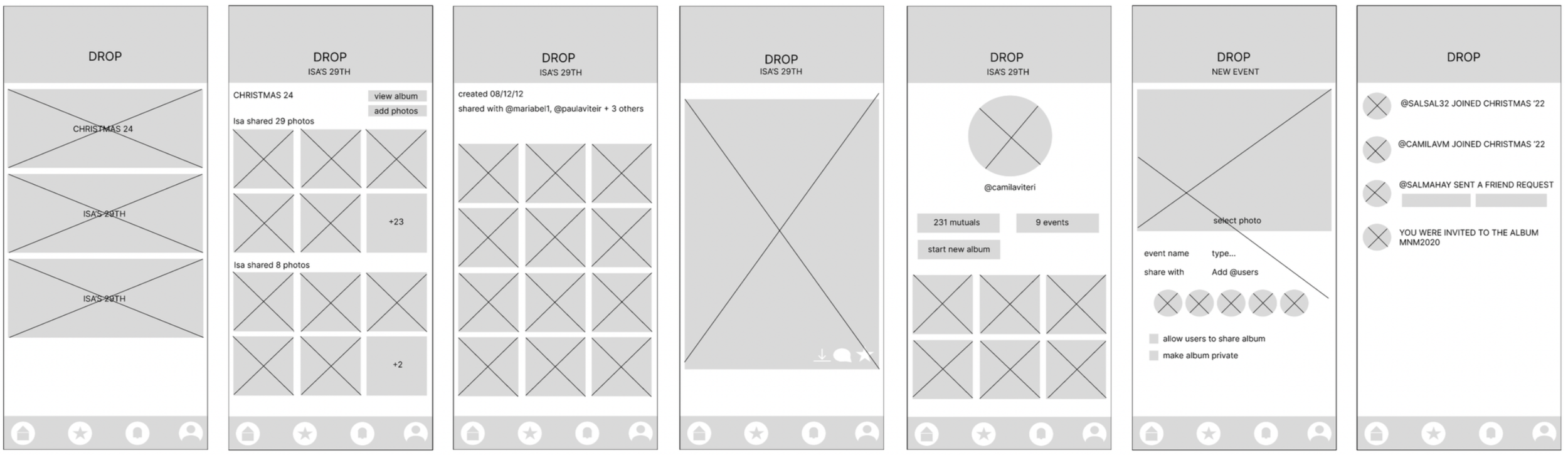
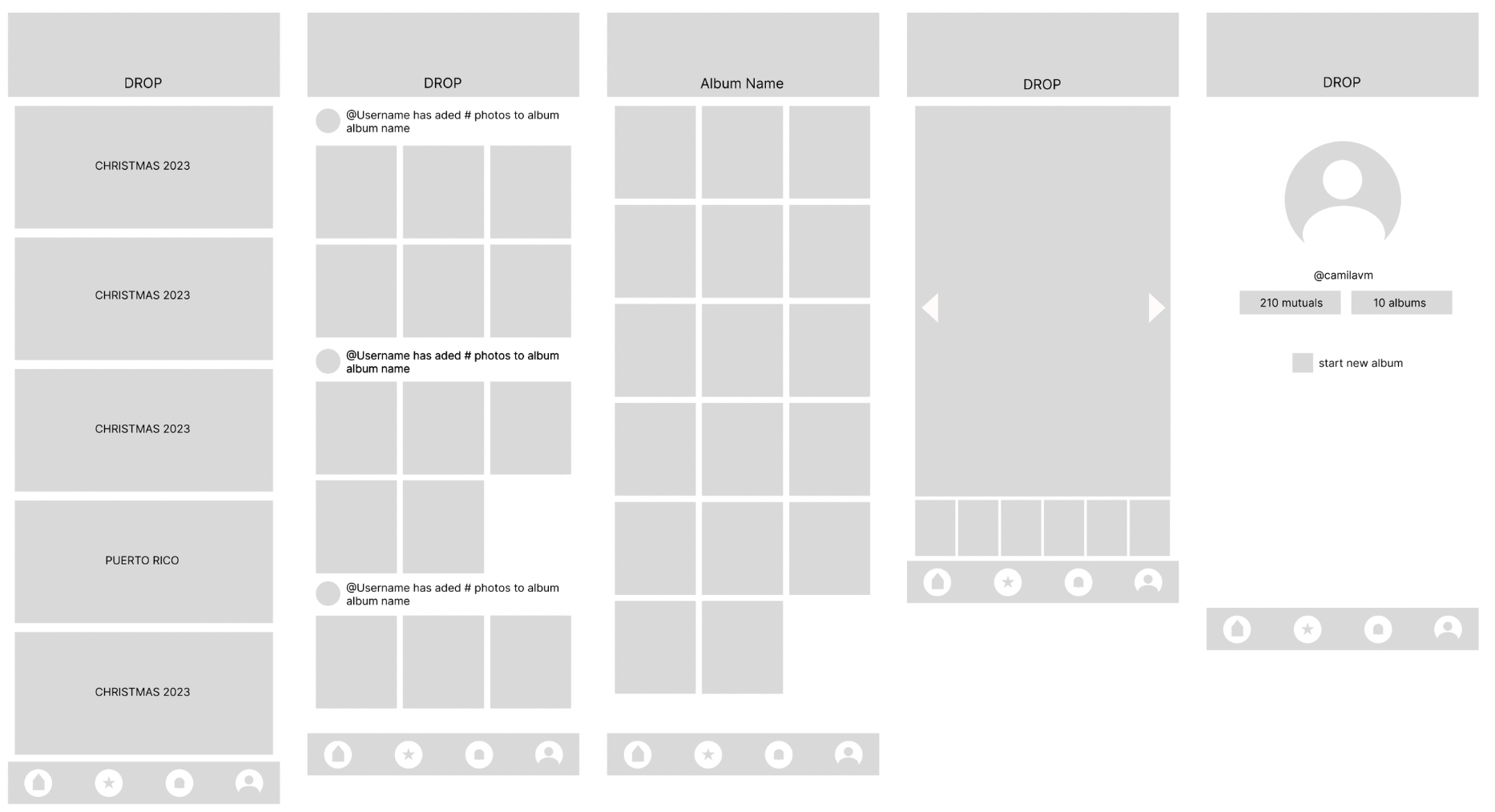
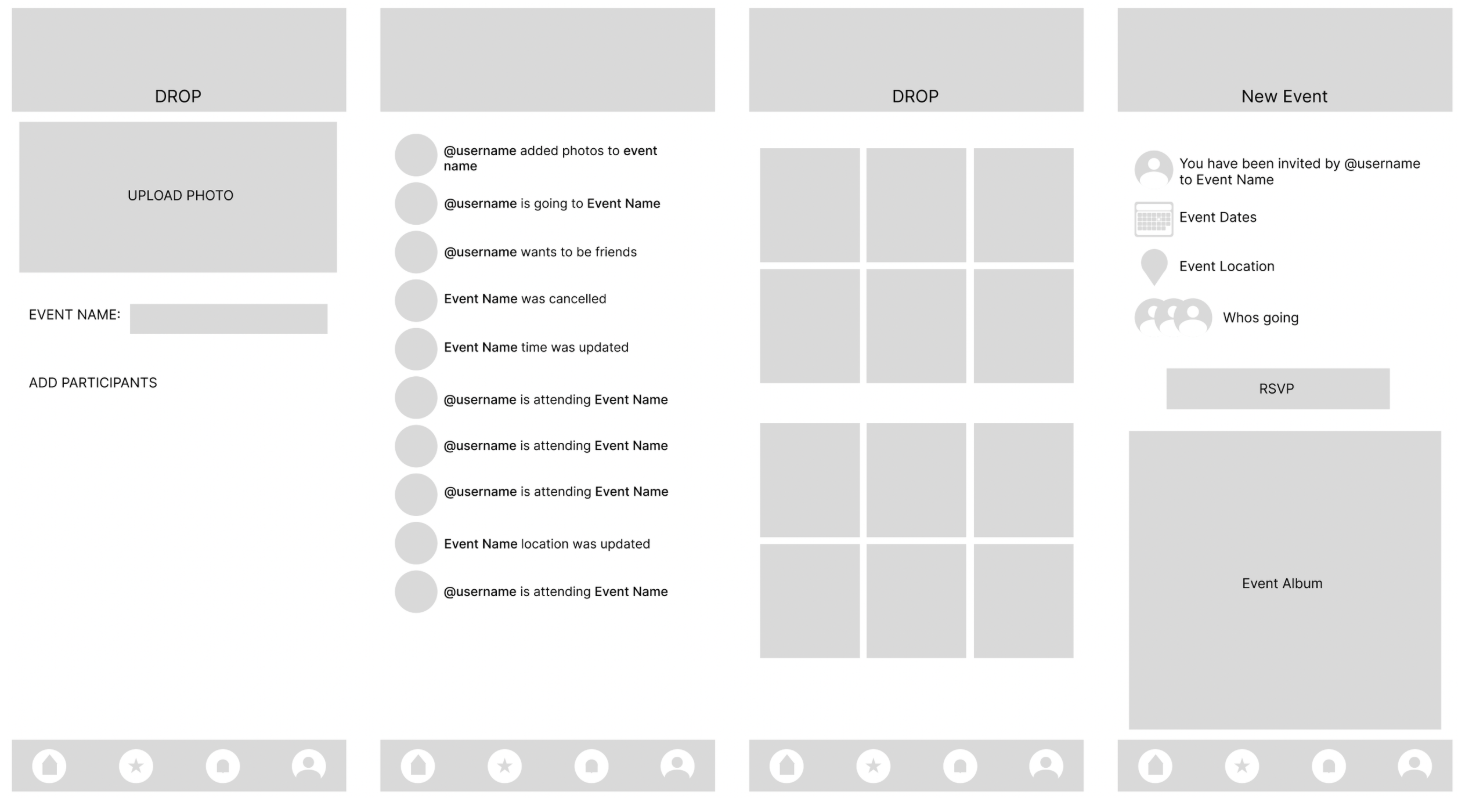
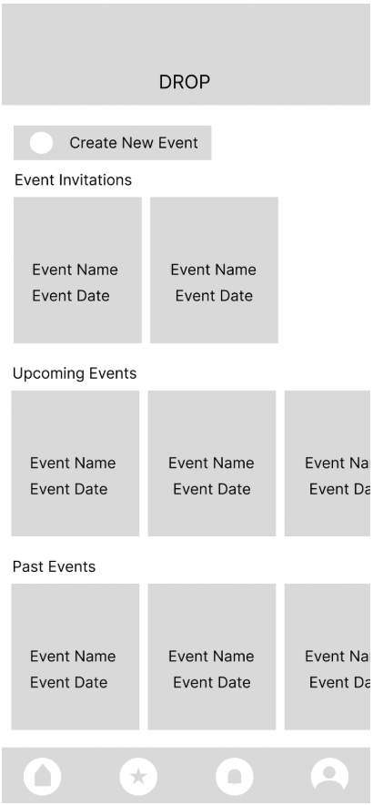
Moving to digital wireframes allowed me to refine the layout, establish hierarchy, and prepare flows for early usability testing.
Digital Wireframes
I connected the digital wireframes into a low fidelity prototype to test core user flows before investing in visual design.
Low fidelity Prototype
Usability Studies Findings
Round 1 Findings
Privacy was the biggest theme. Users weren't sure who could see their photos or event details, and the lack of onboarding left them guessing. Event invites were also easy to miss since they were buried in a general notifications feed.
Round 2 Findings
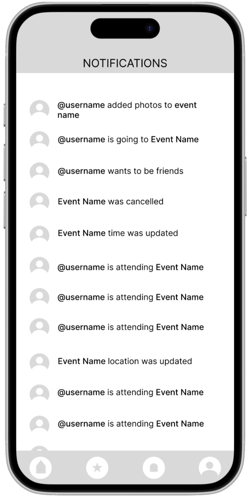
After addressing privacy, more nuanced issues surfaced. Users wanted control over photos of themselves uploaded by others. Navigation labels were missing, making the interface harder to learn. And notifications needed to be customizable, since most users only wanted alerts for invites and tags, not every album activity.
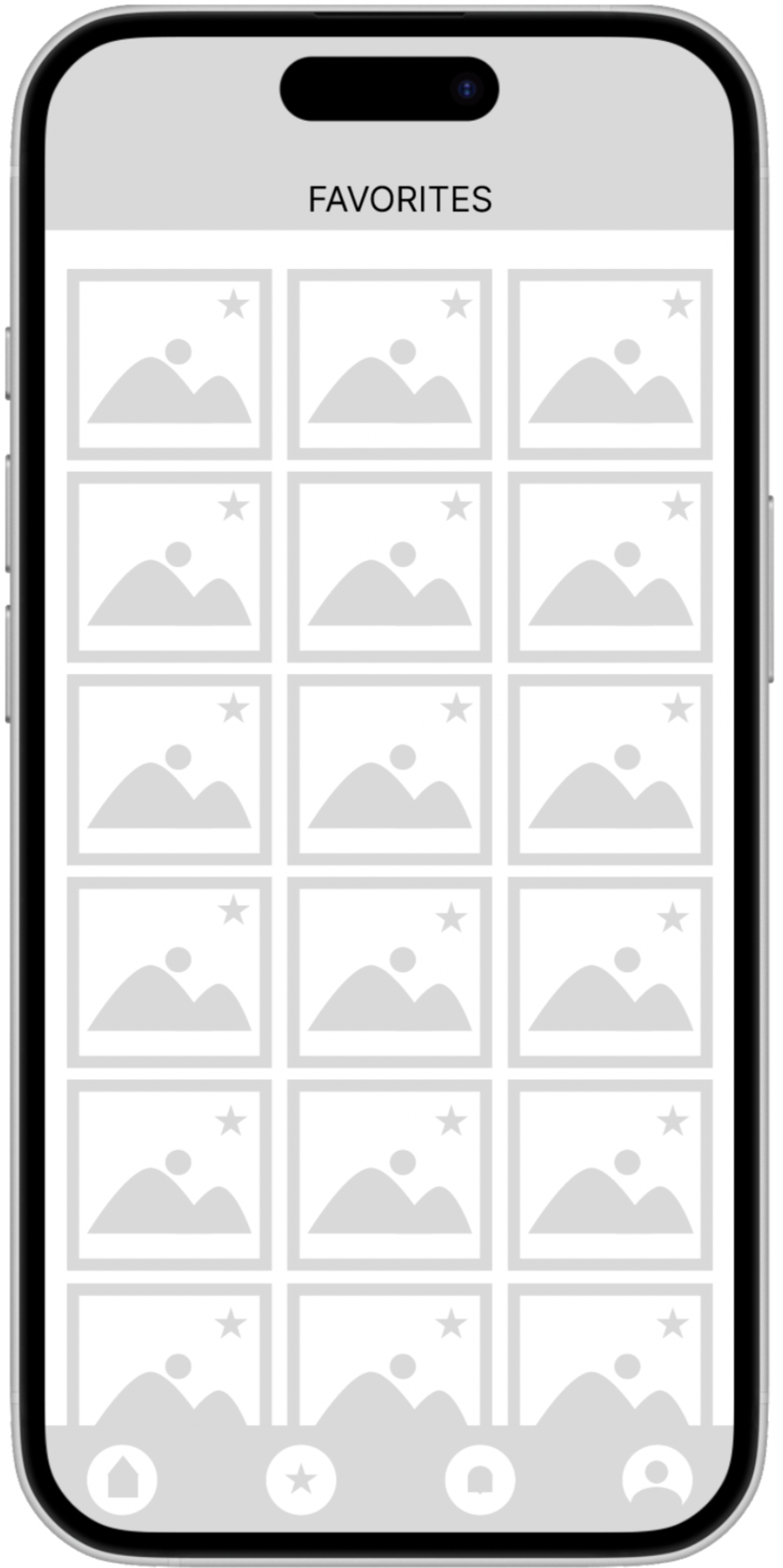
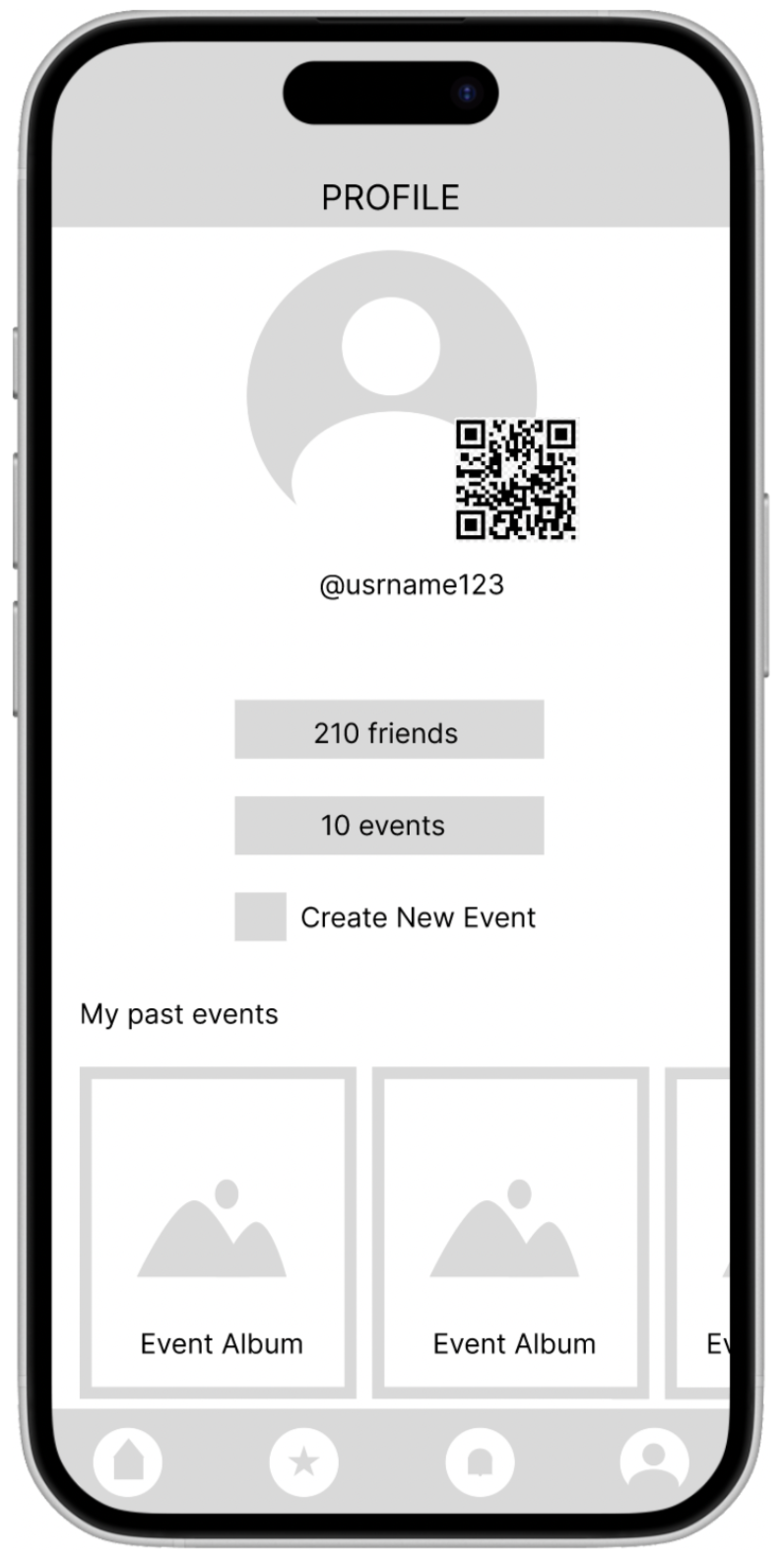
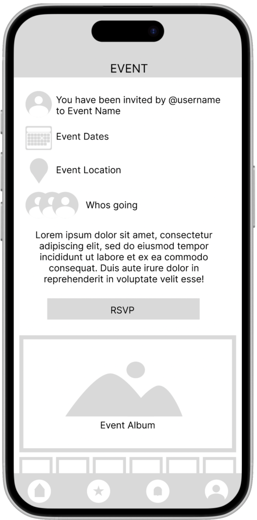
Mockup
Usability testing directly shaped the final designs. Here are some of the key changes made between rounds.
The privacy settings were redesigned to be more transparent, giving users a clear view of who could access their photos and event details. Navigation icons were updated to include labels, reducing ambiguity. And the notifications system was restructured to allow users to choose which actions they wanted to be alerted about
After usability study
Before usability study
After usability study
Before usability study
Before usability study
After usability study
Mockups
High fidelity prototype: before usability study


Accesibility Considerations
Consideration 1
Text Size & Scalability
The app was designed to support dynamic text resizing so users with low vision or custom accessibility settings can comfortably read all content without losing layout integrity.
Consideration 2
Keyboard Navigation
All core functions, including event details, RSVPs, and photo albums, were designed to be fully navigable by keyboard for users who rely on it instead of touch or a mouse.
Consideration 3
Screen Reader Compatibility
Every interactive element was given a clear, descriptive label so screen readers can accurately communicate actions to users, from "RSVP to this event" to "Upload photo to album."
Going Forward & Takeaways
Drop taught me how much friction lives in the spaces between apps. Users weren't struggling with any one platform, they were exhausted by the handoffs between all of them. That insight shaped every design decision, from consolidating event details into a single view to building privacy controls that felt intentional rather than buried in settings.
If I were to continue developing Drop, I would prioritize further usability testing around the photo permissions flow, which remained a point of confusion even after two rounds of iteration. I'd also explore how to make the onboarding experience feel less like a tutorial and more like a natural first event.