Project Overview
The product:
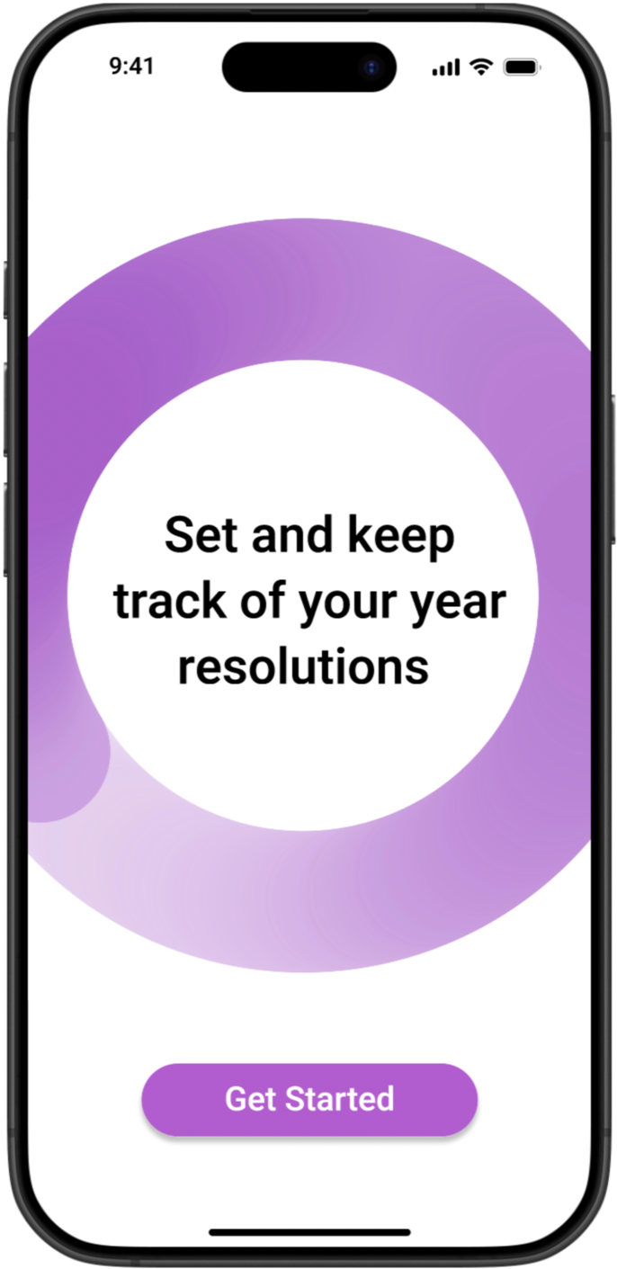
My Goals is a goal-tracking app built around a simple truth: setting a goal and actually achieving it require two very different things. The app helps users define what they want, break it down into trackable increments, and stay motivated through personalized reminders and visual progress, whether they are working toward something daily, monthly, or across the whole year.
Project duration:
November 2023 - February 2024
The problem:
Most people have a system for setting goals: a notes app, a planner, a burst of New Year's energy. What they rarely have is a system for keeping them. Without consistent reminders or any sense of momentum, even well-intentioned goals quietly disappear after a few weeks.
The goal:
Design an app that bridges the gap between intention and follow-through. The focus was not just on helping users log goals, but on giving them the structure, feedback, and encouragement to actually finish what they start.
Understanding the user
User Research:
To understand how people actually manage their goals, I conducted 15 interviews and 45 surveys focused on current tracking habits and where those habits break down. Nearly all participants already had some kind of system in place, whether that was a notes app, a physical planner, or calendar reminders. The problem was not a lack of intention. It was that none of those tools were built to sustain it.
Four key insights shaped the direction of the design:
Users needed simple, step by step goal tracking that did not feel overwhelming to set up.
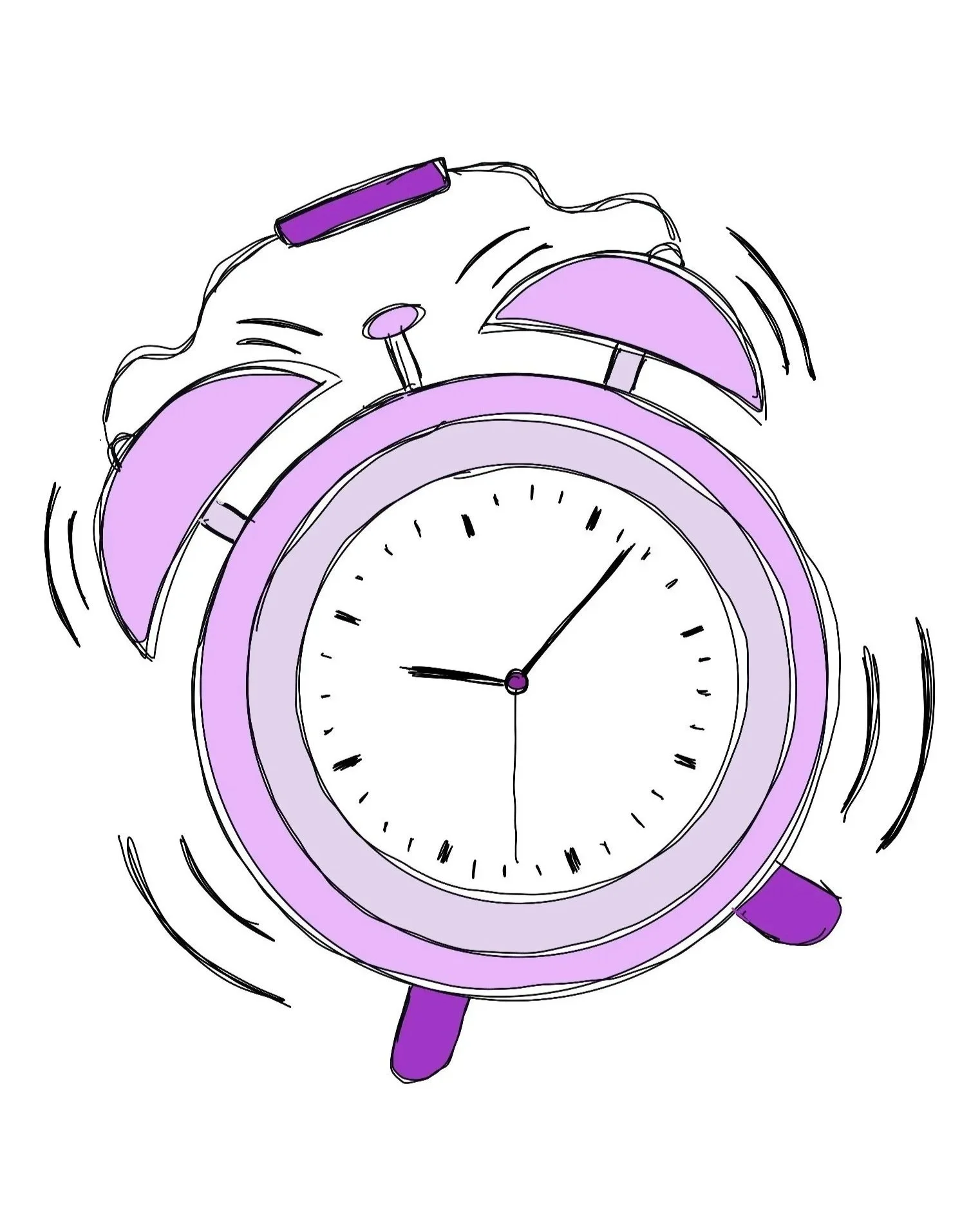
Personalized reminders were essential to staying consistent over time.
Encouragement along the way, not just at the finish line, kept users motivated.
Visual progress gave users a sense of achievement and made their effort feel real.
User Pain Points
Without regular reminders, users lost track of their goals within weeks of setting them, not because they stopped caring, but because nothing brought those goals back into their daily view.
1 Out of sight, out of mind.
The excitement of setting a new goal fades quickly. Users needed more than a record of what they wanted; they needed something that kept them engaged over time.
2 Motivation has an expiration date.
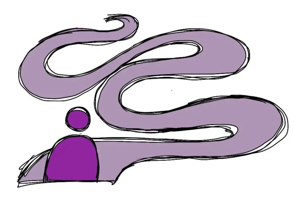
3 No visible progress meant no perceived progress.
When users could not see how far they had come, they felt stuck, even when they were actually moving forward. A sense of momentum was just as important as the goal itself.
A goal tracked by frequency, like exercising three times a week, requires a completely different system than one tracked by a single yearly milestone. Users struggled to manage both in one place.
4 Goals do not all measure the same way.
Understanding the User
Age: 42
Education: Bachelor Degree
Hometown: Brooklyn
Family: Married
Occupation: Marketing Manager
Natalie
““I get so wrapped up in client calls that my personal goals slip through the cracks.””
Frustrations
Her goals get buried under the demands of her workday and rarely resurface on their own
She knows what she wants to achieve but struggles to put it into a format she can actually track, especially when different goals require completely different measures of success
Goals
See her progress visually so her effort feels tangible and real
Build consistency over time, not just start strong and fade
Feel a genuine sense of accomplishment that keeps her wanting more
Natalie wants to exercise three times a week. It is a reasonable, achievable goal, and she knows it. But between back to back client calls and project deadlines, her personal priorities keep getting pushed to tomorrow. The issue is not willpower. It is that she has no system working in her favor when work fills every available gap.
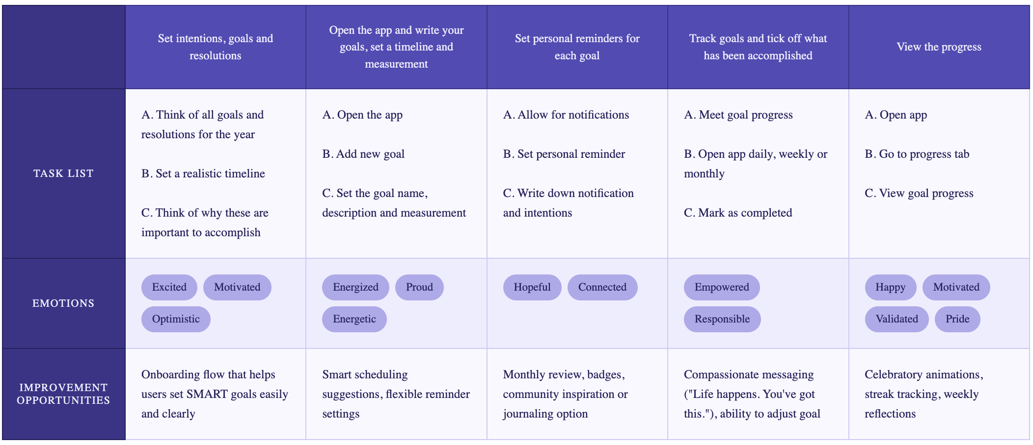
Mapping Natalie's journey revealed something important: her emotional arc is almost entirely positive. She starts excited, moves through the app feeling energized and hopeful, and ends feeling validated and proud. The challenge is not the experience itself; it is everything that happens outside the app that threatens to break the habit before it forms. The improvement opportunities identified at each stage, from smarter onboarding to compassionate messaging when she falls behind, became the foundation for the design decisions that followed.
User Journey Map
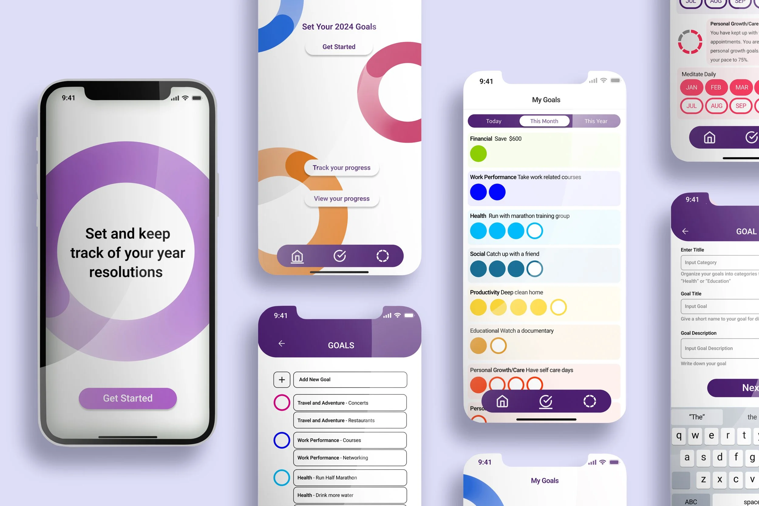
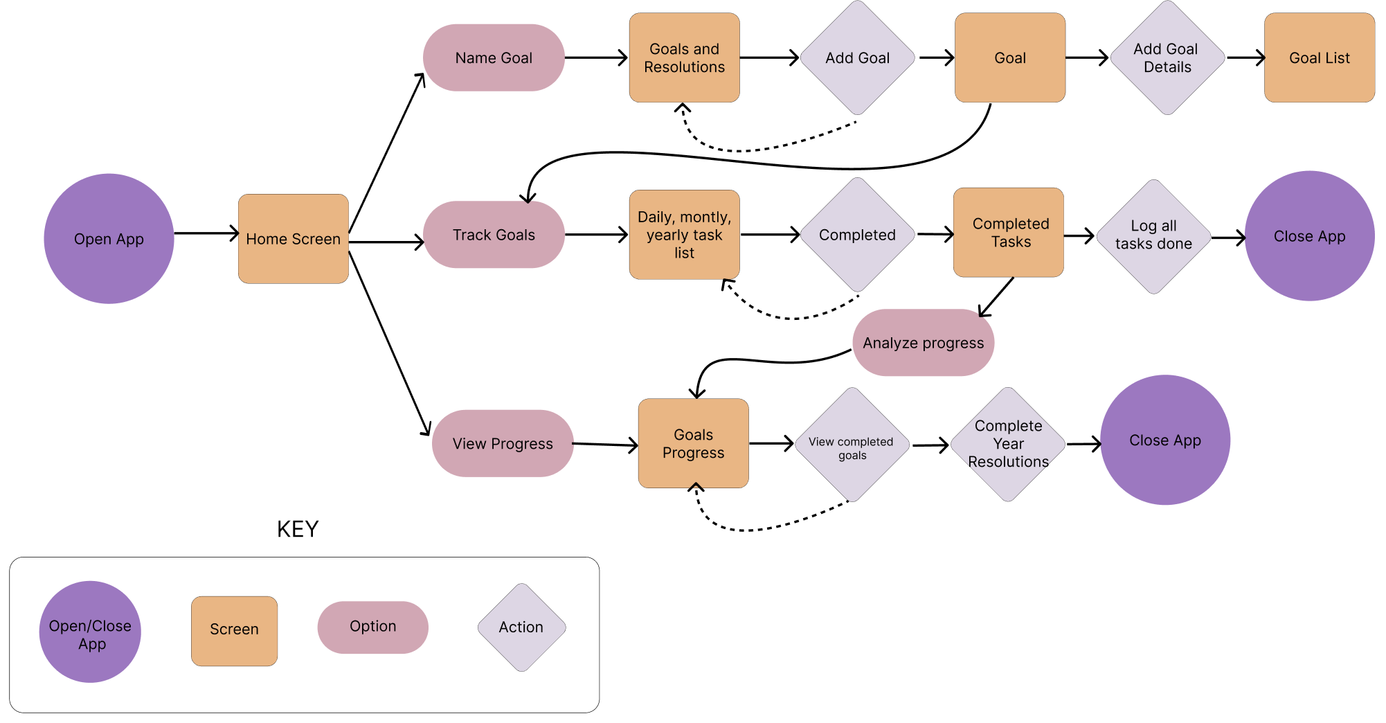
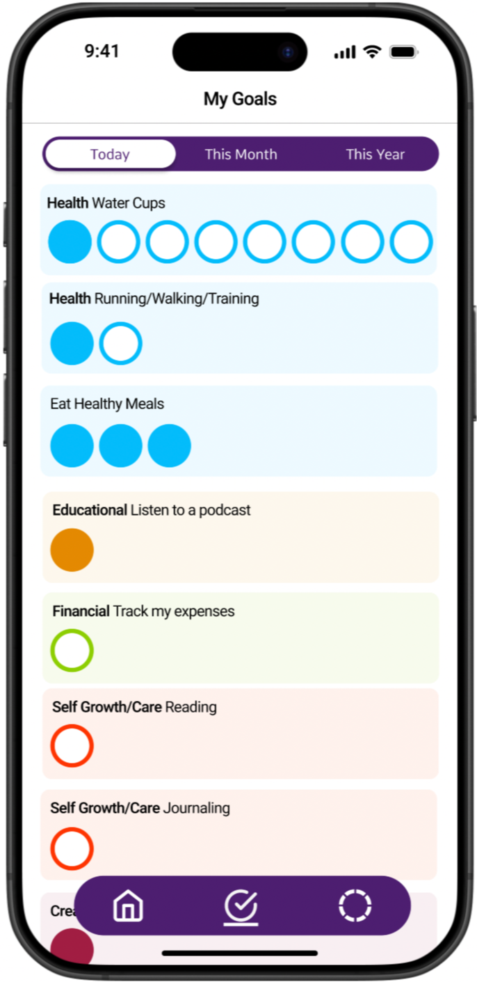
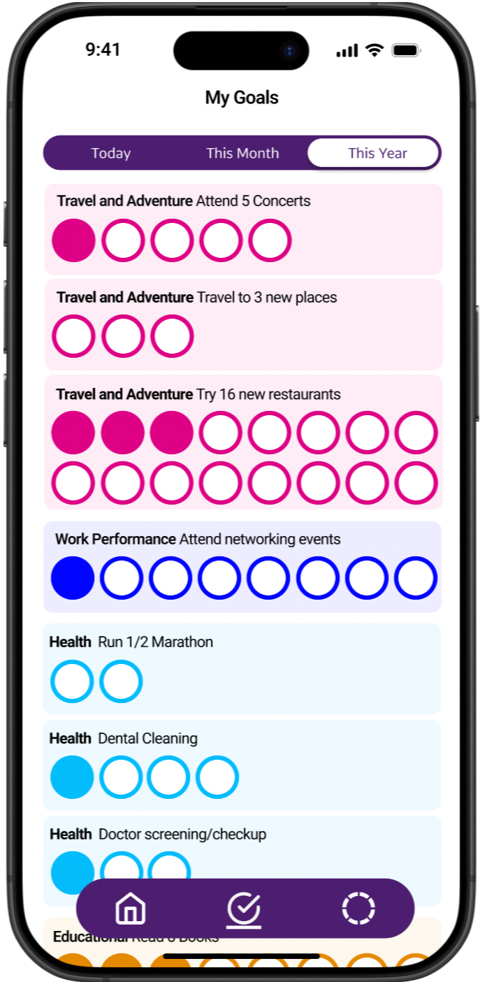
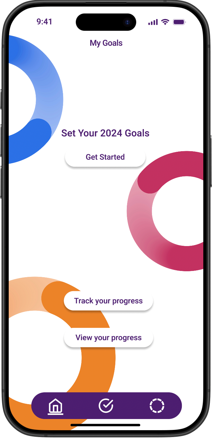
The app centers around three core paths from the home screen: setting a new goal, tracking daily progress, and viewing overall progress. Each path was designed to feel self-contained so users could drop in and out quickly without losing context. The goal creation path loops back to allow multiple goals to be added in one session, while the tracking and progress paths converge around a shared view of completed tasks, giving users a consistent picture of how far they have come.
User Flow
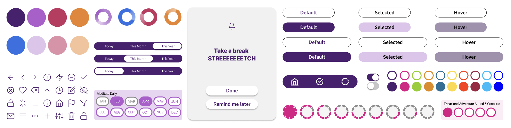
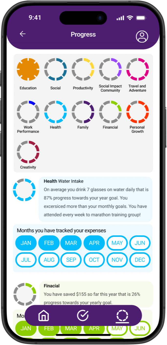
The palette leads with deep purple to anchor a sense of calm intention, with pops of pink, orange, and blue adding energy to progress indicators and goal categories. Button states, toggles, and the circular progress rings were kept deliberately simple so users can read their status at a glance.
Design System
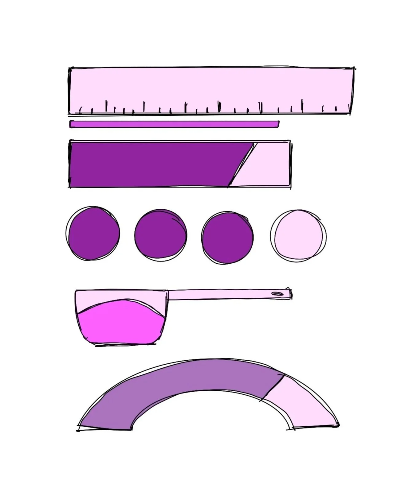
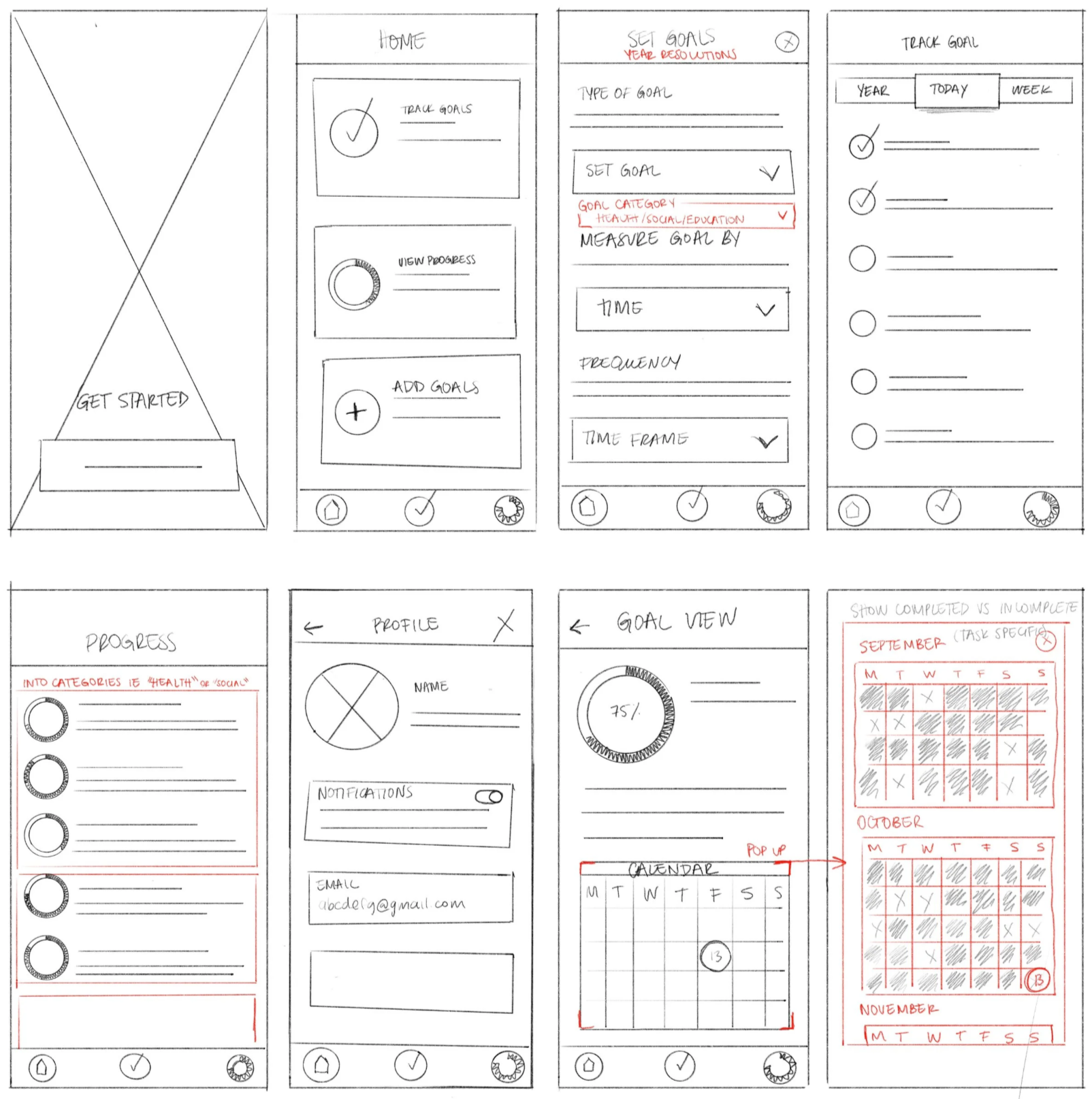
Paper Wireframes
Early sketches focused on the three core screens: goal creation, tracking, and progress. Red markup flagged areas needing rethinking, particularly around goal measurement and the calendar view. Resolving these decisions on paper meant the bigger structural questions were already answered before moving to digital.
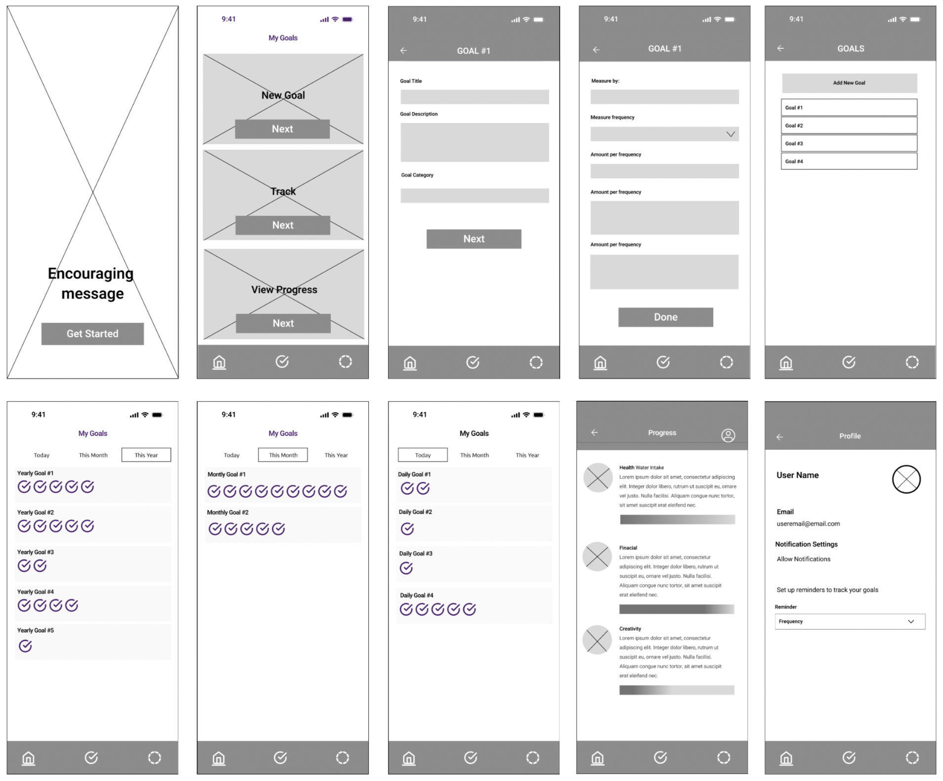
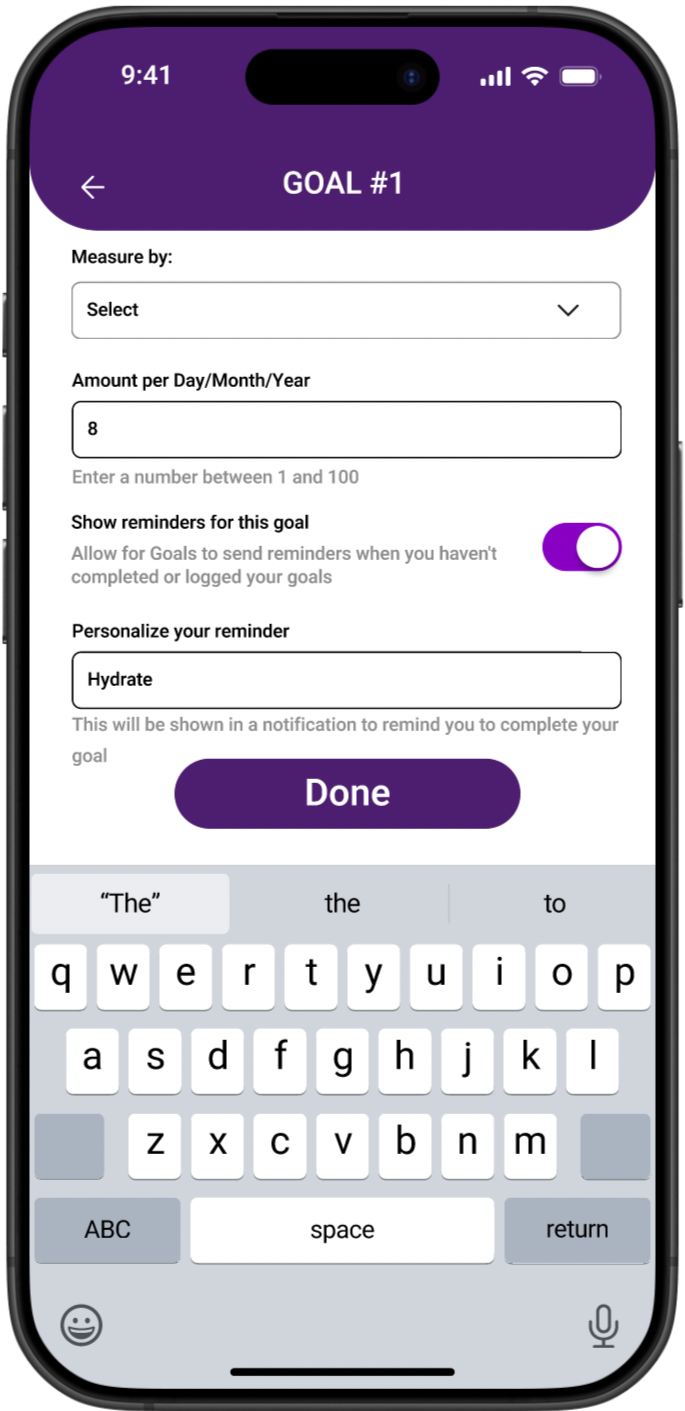
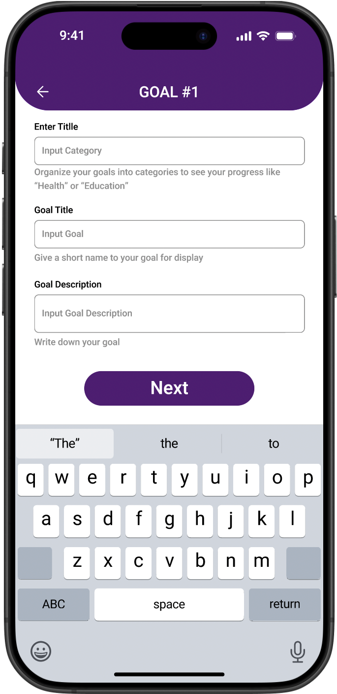
Digital wireframes brought the full ten screen structure into focus, from onboarding and goal creation through tracking, progress, and profile. Breaking goal creation into steps kept it from feeling overwhelming, while separating daily, monthly, and yearly tracking views gave each goal type its own legible space.
Digital Wireframes
Round 1 Findings
The first round of testing surfaced friction in the goal creation flow, which users found too long and form heavy. Terminology was also a sticking point: "amount" and "frequency" created confusion that slowed users down. On the positive side, users responded well to circular progress visuals and wanted more of them.
Usability Studies Findings
Round 2 Findings
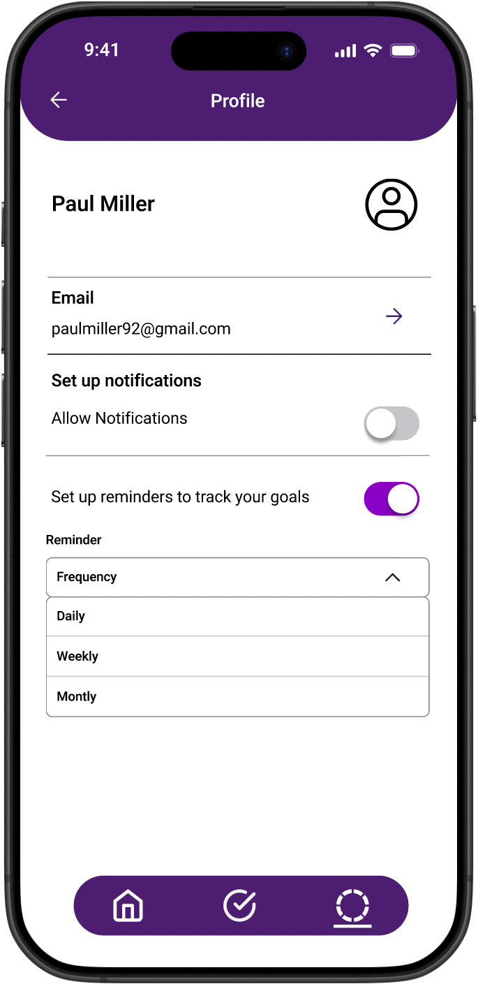
The second round focused on refinement. Users wanted per goal notification settings rather than a single global reminder. Helper text was missing across input fields, leaving users to guess at what was expected. The progress view needed to breathe, with a cleaner monthly breakdown and a simplified progress wheel.
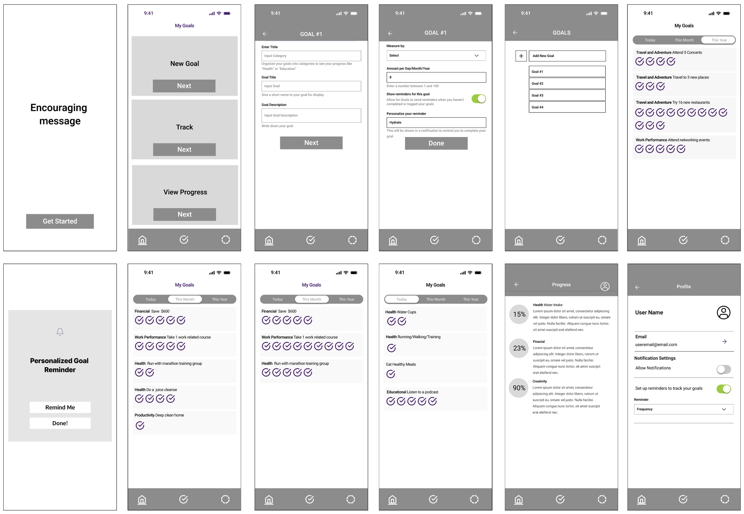
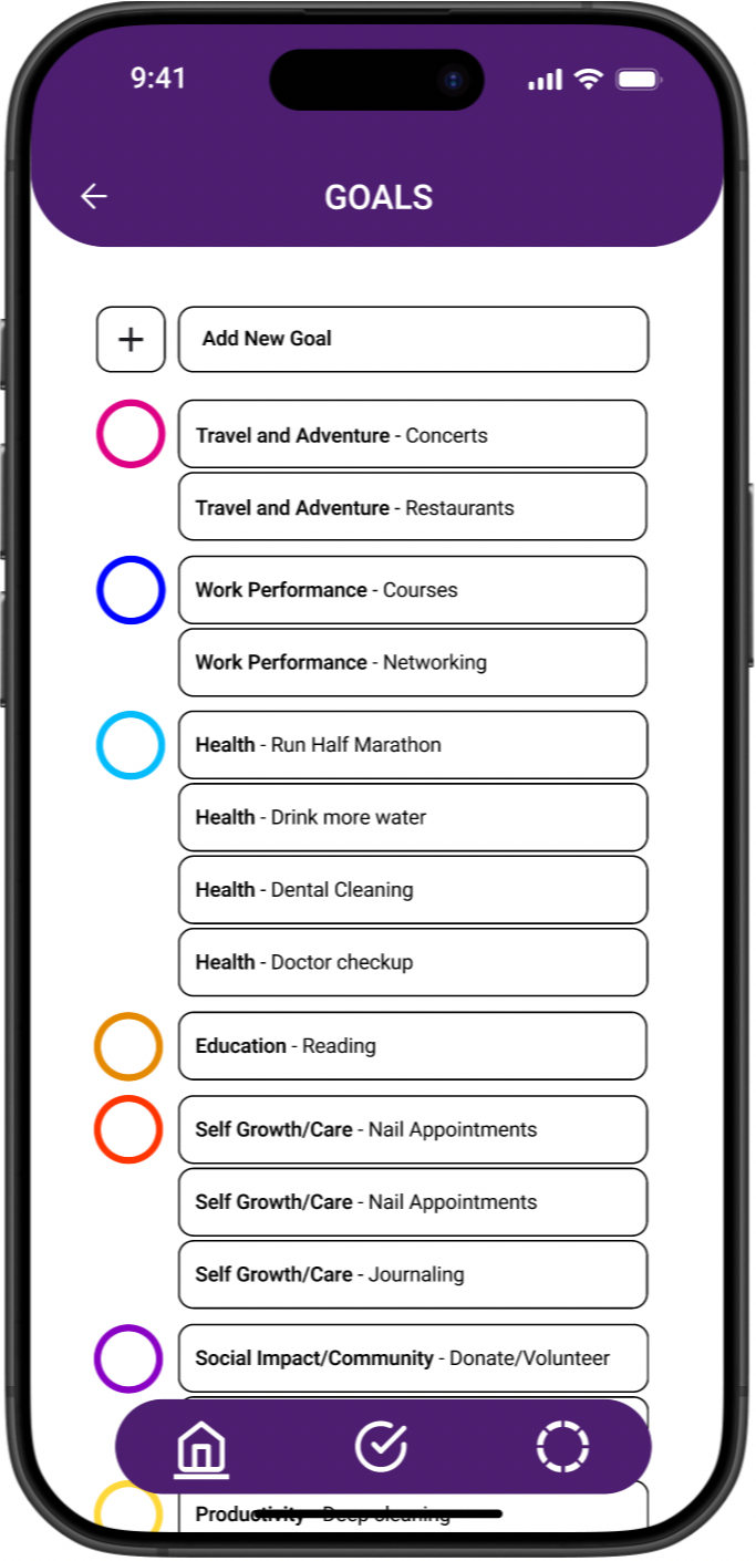
The mockups translated the wireframe structure into a fully fleshed out experience. Helper text was added throughout the goal creation flow to guide users at every input, and per goal reminder toggles gave users direct control over their notifications. The tracking screens show goals organized by category across daily, monthly, and yearly views, while the progress screen surfaces completion percentages at a glance. Every screen reflects a direct response to what usability testing surfaced.
Mockups

Accessibility Considerations
1
Clear labels and helper text were added throughout, with consistent navigation patterns and repeated elements like the bottom nav bar to support screen reader users.
2
Progress is communicated through filled and unfilled rings rather than relying on color alone, so the experience remains clear for users with color vision differences.
3
Color contrast, text size, and touch target sizes were all considered to ensure the interface is readable and usable across a wide range of abilities.
This project taught me that goals are not static. As users tracked their progress, it became clear that the act of measuring a goal often changes it: sometimes a target feels too small once you are moving toward it, and sometimes life shifts in a way that requires the goal itself to shift. A next step for My Goals would be exploring how the app can support that evolution, giving users the flexibility to adjust, expand, or reframe their goals without feeling like they have failed. The best goal tracking tool is not one that holds users to what they wrote in January. It is one that grows with them.
Going Forward & Takeaways